Clustering of similar product items can help decision makers strategically plan product mixes which can affect overall business strategy. In this post, I go over how to group similar products together using data from an online events retailer.
The Technical Gist
Don’t “blindly” standardize/normalize features without thinking about what you are actually trying to convey with each feature. Sometimes it makes more sense to normalize row-wise.
If you value interpretability of clusters over all else, the features you engineer must make sense and come from hypotheses that you have formed from looking at the data.
Beware of “hubs” in the data. Consult the distribution of the k-neighbourhood distances to see if this is an issue. The more features you have, the more likely that this problem will arise. Use a method such as Global Scaling using Mutual Proximity to mitigate this issue.
Mutual Proximity scaled distances are much easier to explain to stakeholders than opaque Euclidean distances.
Context
The data comes from the UCL Machine Learning repository. It consists of transactions for a two year time period from an online retailer based in the UK but they do sell to countries around the world. All currency values are in pounds Sterling. This business sells to both wholesalers and the general public. The products that are sold on the site are items for all sorts of occasions such as parties and events.
Let’s presume you were enjoying a cup of coffee at work and Mark from marketing approaches you for your help. Essentially, he says this to you:
Hey, I would appreciate it if you could have a look at this sales data and find any interesting trends in the product relations.
It’s ill defined and vague. What is a relationship? If a relationship is found, when is it of business value? What does he want to achieve? Is this the right data? This is a scenario that a data scientist could face in the so-called “real world”.
I will present one view on tackling this sort of problem through clustering of items sold on the website.
Aim
Since I wasn’t given any clear direction from Mark, I will have to come up with a sensible set of objectives that make sense within the online retailer’s context. In reality I would pry for a little more information, but let’s presume that this is not possible.
I seek to answer the following questions:
Which products are similar to each other based off of their sales performance likeness and/or product likeness?
Can these clusters be used to meaningfully partition items into separate groups that makes sense from a business perspective?
Are there any obvious sales trends per cluster?
Cleaning
The first step is to interrogate the data and clean it as necessary. Here is an example from the transactional data:
| Invoice | StockCode | Description | Quantity | InvoiceDate | Price | Customer ID | Country |
|---|---|---|---|---|---|---|---|
| 489434 | 85048 | 15CM CHRISTMAS GLASS BALL 20 LIGHTS | 12 | 2009-12-01 07:45:00 | 6.95 | 13085 | United Kingdom |
| 489434 | 79323P | PINK CHERRY LIGHTS | 12 | 2009-12-01 07:45:00 | 6.75 | 13085 | United Kingdom |
| 489434 | 79323W | WHITE CHERRY LIGHTS | 12 | 2009-12-01 07:45:00 | 6.75 | 13085 | United Kingdom |
A single transaction can occupy multiple rows. Each row is uniquely identified by the combined key of the Invoice-StockCode pair.
Upon looking at the data, cancelled invoices are invoice numbers preceded by the letter “C”. Additionally, the StockCodes B, M or ADJUST represent adjustments made and not actual sales. This emphasises that knowledge of both the business domain and the systems recording the information is paramount in conducting sensible analysis.
# Keep A record of the item descriptions to allow for easy lookup
stockcode_lookup <- dplyr::select(retail, StockCode, Description) %>% distinct()

# Remove rows that do not represent completed sales
retail <- retail %>%
  mutate(cancelled = str_detect(Invoice, pattern = "C")) %>%
  filter(!(StockCode %in% c("B","M","ADJUST"))) %>% # Exclude the adjustment rows
  filter(!cancelled) %>%  # Only include orders not cancelled
  filter(Quantity > 0) #Remove Returned Orders and Corrections
Exploratory Data Analysis
I will perform some basic statistical analysis and visualisation to get a sense of the trends in the data This will help me to create useful features to be used for clustering. In my opinion, it is important to have a principled reason for creating a feature and to not over-engineer some nonsense feature that has no meaning.
In previous situations where I have worked with retail data, what tends to happen is that a small proportion of products account for a large percentage of overall revenue. Let’s see if that is the case here.
total_rev_per_item <- retail %>%
                          group_by(StockCode) %>%
                          summarize(revenue = sum(Quantity * Price)) %>%
                          arrange(desc(revenue))
#NB: Arrange in descending order. Allows for monotonic increase in proportion plot

# Calculate Cumulative Proportions of Revenue
total_rev_prop <- total_rev_per_item %>%
                    mutate(proportion = revenue/sum(revenue))
# Plot the cumulative proportion of each stock item

par(mfrow = c(1,2))
plot(
  cumsum(total_rev_prop$proportion),
  type = "l",
  col = "darkgreen",
  xlab = "Unique StockCode Index",
  ylab = "Cumulative Proportion of Total Revenue",
  lwd = 2,
  main = "Revenue Dominance of the Few"
)
boxplot(total_rev_prop$proportion, ylab = "Proportion of Revenue per Item", main = "Individual Item Prop. of Revenue")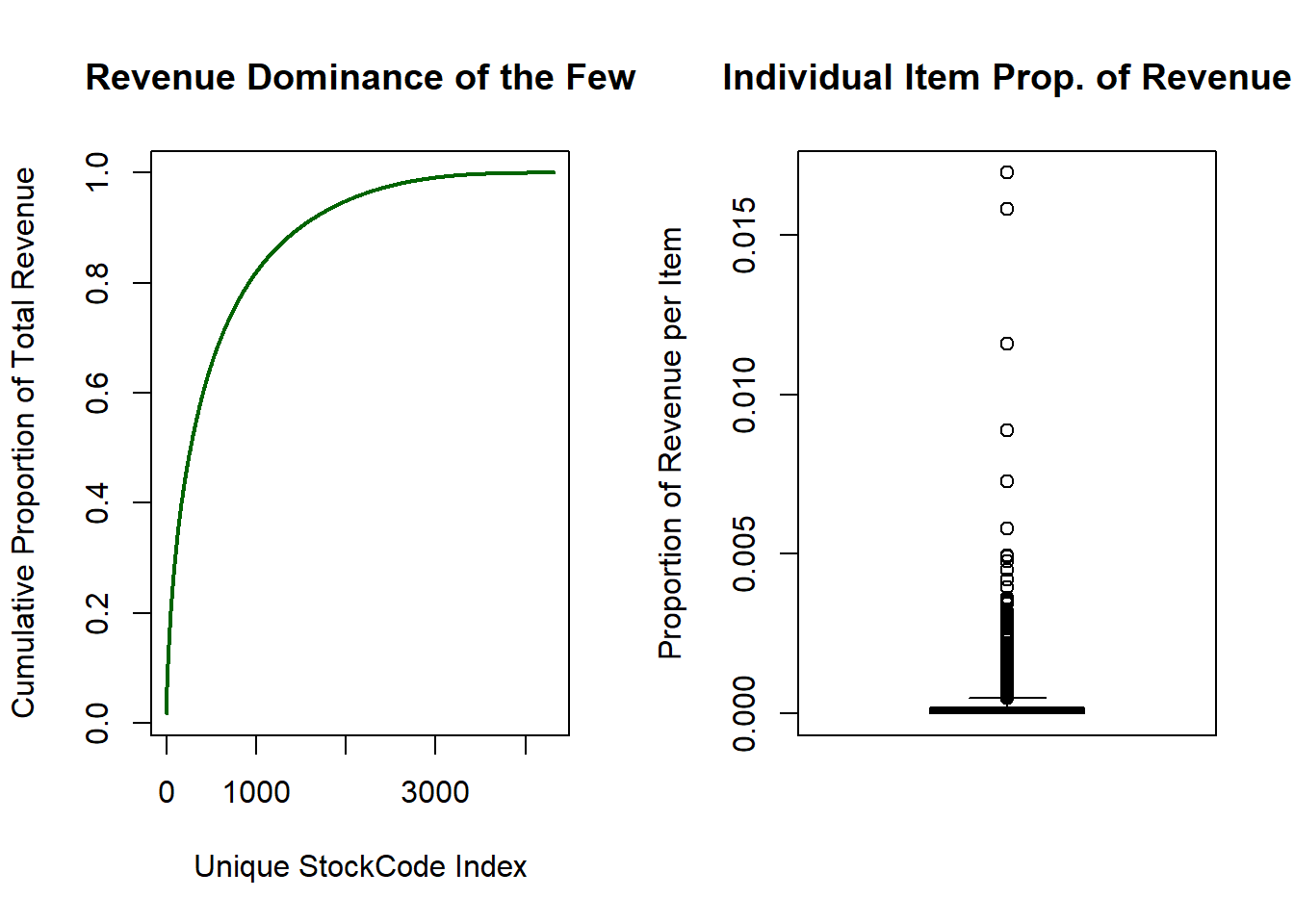
The boxplot shows that a large percentage of items contribute marginally to the overall revenue. The left-hand plot illustrates how dominant a subset of the items are in generating profit. There are 4313 unique products yet the top 900 items generate close to 80% of all revenue!
What this tells me is that the mean value as a description for the revenue data is inappropriate as it may skew results towards a subset of the items. The median should be used as it is more robust to outliers.
In my opinion, it is important to have a principled reason for creating a feature and to not over-engineer some nonsense feature that has no meaning.
This is even more clear when we consider the Quantity distribution of each unique item bought in a transaction. Consider the quantiles below where each numeric value is the Quantity bought.
#Print Out Deciles Of Quantity Bought of Each Item
quantile(retail$Quantity,probs = seq(0,1,length.out = 21))
## 0% 5% 10% 15% 20% 25% 30% 35% 40% 45% 50% 55% 60%
## 1 1 1 1 1 1 2 2 2 3 3 4 6
## 65% 70% 75% 80% 85% 90% 95% 100%
## 6 8 11 12 12 24 32 1915295% of all quantities bought in a given invoice transaction is below 32 but the maximum is 19152! It is important to note again that this retailer sells both to the general public and wholesalers. Upon looking at the data, these extreme quantity data points are sensible as they reflect large wholesale purchases. I do not want to remove them as the “wholesaler” effect is something that I wish to take into account.
Finally, the total revenue per country is examined to see if sales are uniform across regions. The top 10 countries are visualised below.
retail %>%
  group_by(Country) %>%
  summarize(total_rev = sum(Quantity*Price)) %>%
  arrange(desc(total_rev)) %>%
  mutate(prop = total_rev/sum(total_rev)) %>%
  mutate(Country = fct_reorder(as.factor(Country),.x = prop)) %>%
  slice(1:10) %>%
  ggplot(aes(
    x = Country,
    y = prop * 100,
    label = paste0(round(prop * 100, 1), "%"),
    fill = Country
  )) +
  geom_bar(stat = "identity") +
  geom_text(nudge_y = 2) +
  labs(y = "% Proportion Of Total Revenue", title = "Sales by Country") +
  theme_minimal() +
  theme(legend.position = 0)
The United Kingdom dominates the total revenue with the Republic of Ireland (EIRE) at a distant second. What this is telling me is that using the dominant country per item as a feature for clustering will not be useful since it will most likely be the UK for all/most items. This informed how I encoded the by country performance characteristic when creating features.
Feature Engineering
Feature engineering is a fancy term for describing the process of creating new useful variables which will help in achieving your modelling goal. Explicitly creating features has the advantage over other methods such as the representation learning approach of neural networks in that they tend to be understandable.
The features that I have decided to create from the sales data for each item is:
- Normalized Median Quantity sold –> CONTINUOUS
- Median was deemed to be a better reflection of the average than the mean from the boxplot. This quantity was normalised such that the minimum median quantity has the value 0 and the maximum has the value 1.
- Proportion of each item’s total revenue sold in each country –> CONTINUOUS
- There are 40 unique countries in the data set. I suspect that nuances in the relative proportions between item’s is informative.
- Normalized max quantity of the item bought across all transactions –> CONTINUOUS
- Initially I used a binary variable which took on the value 1 if an item was bought for more than 32 units in a transaction. This created a problem when calculating the distances as this feature dominated the clustering. Two distinct clusters where formed around this binary variable with little variation within those clusters. I desired a more nuanced clustering of the items which depends on all of the features that I have created. The normalized max quantity allowed for this.
- Prevalence rate of an item in all transactions –> CONTINUOUS
- This is used as a proxy to determine how popular an item is or how quickly it moves. This feature tries to estimate the probability of a given item being present in any arbitrary transaction. This is different from median quantity in that this feature does not speak to how many units are bought in a transaction.
- Normalized Price in Pounds Sterling of the item –> CONTINUOUS
One might wonder as to why I did not include total revenue as a feature. Total revenue is acting through the prevalence rate, median quantity and price. Total revenue may also produce biased results as a given item may not be sold in all regions or this item was only introduced mid-way through the year.
Normalization or Standardization of features?
Another point to note is that the ranges of all variables lie in a [0;1] range. This is crucial as a Euclidean distance will be used to measure the distance between points. If the features are in different scales, say one is in millions and the other in tens, then the distance metric will be heavily skewed to the feature where each entry is in the millions.
One might ask why I didn’t standardize rather than normalize the features such as price and median quantity. Let’s review how these two transformations differ. Normalization reflects numerical values of a variable in terms of standard deviations above or below its mean. Normalization will reflect values relative to its maximum value.
The median values and price differ wildly across different items. This will result in a high standard deviation if I were to standardize the values. This creates a problem in how I should calculate the average or tendency of a very diverse set of items. I believe that normalizing values relative to the max values would be more informative within the context of eventually calculating relative differences/distances between items.
# Calculate the proportion of an item's total rev. per country
per_country_prop_rev <- retail %>%
    group_by(StockCode,Country) %>%
    summarize(country_rev = sum(Price*Quantity)) %>%
    group_by(StockCode) %>%
    mutate(prop_rev = country_rev/sum(country_rev)) %>%
    select(-country_rev) %>%
    pivot_wider(names_from = Country,values_from = prop_rev)
# Zero out cases where an item is not sold in a country
per_country_prop_rev[is.na(per_country_prop_rev)] <- 0


# Create the features mentioned in the post
item_performance <- retail %>%
  group_by(StockCode) %>%
  summarize(max_qty = max(Quantity),
            med_qty = median(Quantity),
            prevalence_rate = n()/sum(nrow(retail)),
            price = mean(Price)
            ) %>%
 # mutate(bulk =if_else(max_qty <=32,0,1)) %>%
 # select(-max_qty) %>% # Remove max qty as BULK feature reflects the same signal
  inner_join(.,
            per_country_prop_rev,
            by = "StockCode")

# Function to normalize appropriate continuous varaiables
norm_vec <- function(x){
  x/(max(x)-min(x))
}

continuous_variables <- c("med_qty","price","max_qty")

#Store Range Values of Normalized Features to recover original values later
normalized_vars_ranges <-     item_performance[,continuous_variables] %>%
                    apply(.,2,range)


#normalise other numerical quantityies
item_performance[,continuous_variables] <-
                    item_performance[,continuous_variables] %>%
                    apply(.,2,norm_vec)
Dropping Constant Features
Some features in the item_performance dataframe had close to zero variance. This is a problem because if a feature does not sufficiently vary across items, it will be in no way beneficial in discriminating or clustering similar items together. The caret package by Max Kuhn has a useful function called nearZeroVar which I used to remove these features.
All the features that were dropped related to the proportion of an item’s revenue in certain countries. The regions where there was sufficient variability included the UK, Spain and Sweden as well as a few others. A total of 28 countries were dropped and this significantly reduced the overall dimensionality which makes clustering an easier task.
near_zero_cols <- caret::nearZeroVar(item_performance)

item_performance <- item_performance[,-near_zero_cols]
Standardization reflects numerical values of a variable in terms of standard deviations above or below its mean. Normalization will reflect values relative to its maximum value
Here are the first 3 rows of the item_performance dataframe which will be used to calculate the distances between items:
| StockCode | max_qty | med_qty | prevalence_rate | price |
|---|---|---|---|---|
| 10002 | 0.0208866 | 0.0048563 | 0.0006243 | 9.54e-05 |
| 10002R | 0.0001044 | 0.0004047 | 0.0000059 | 5.07e-04 |
| 10080 | 0.0046995 | 0.0004047 | 0.0000137 | 7.20e-05 |
| StockCode | EIRE | France | Germany | Italy | Netherlands | Spain |
|---|---|---|---|---|---|---|
| 10002 | 0.0064374 | 0.0917323 | 0.0289681 | 0.0421268 | 0.0016093 | 0.009656 |
| 10002R | 0.0000000 | 0.0000000 | 0.0000000 | 0.0000000 | 0.0000000 | 0.000000 |
| 10080 | 0.0000000 | 0.0000000 | 0.0000000 | 0.0000000 | 0.0000000 | 0.000000 |
| StockCode | Sweden | Switzerland | United Kingdom | Portugal | Belgium | Channel Islands |
|---|---|---|---|---|---|---|
| 10002 | 0.0016093 | 0.014484 | 0.7660386 | 0 | 0 | 0 |
| 10002R | 0.0000000 | 0.000000 | 1.0000000 | 0 | 0 | 0 |
| 10080 | 0.0000000 | 0.000000 | 1.0000000 | 0 | 0 | 0 |
Distances between items
The Euclidean distance was used to measure the dissimilarity between items. This is an appropriate measure to use as all of the features are continuous numeric variables.
The rectangular item_performance dataframe of dimensions (Num. Items ; Num. Features) is transformed into a square distance matrix of dimensions (Num. items ; Num. items).
The distances were randomly jittered by a random Gaussian noise variable. The reason for doing this is because there exists a few products which, as an illustrative example, have the stock codes 1000A and 1000B. They are the same product but sold in different countries. By pure chance, the exact same quantities were bought at the same price, but at completely different timestamps. Therefore the distance between these two different items is exactly 0. When I visualize the clusters using multidimensional scaling, it requires that there are no 0 distances. The jittering has no material affect on the clustering performed.
# Calculate the distance/dissimilarity matrix
item_performance_dist <-
                        item_performance %>%
                        select(-StockCode) %>%
                        cluster::daisy(x = .,metric = "euclidean")

# Temporarily store the dasiy object attributes
att <- attributes(item_performance_dist)

set.seed(1)
item_performance_dist <-
  (item_performance_dist +
  abs(rnorm(n = length(item_performance_dist),sd = 0.01))) %>% as.dist()


# Plot Distribution of distances
item_performance_dist %>%
  as.matrix() %>%
  as.numeric() %>%
  density() %>%
  plot(main = "Distribution Of Distances",
       xlab = "Euclidean Distance between items",
       lwd = 3)
So Close Yet So Far
I would like to alert you to an issue created by the Curse of Dimensionality. It is as a result of the concentration phenomenon. Concentration is the tendency for objects in a high dimensional space to be at almost the same distance away from every other point. This creates a “hubness” issue. The method used to address this as well as a full description of the issue can be found in this paper by Schnitzer and Schedl.
Loosely speaking, as you increase the dimensions (i.e. the features) of the items you wish to cluster, you are dramatically increasing the volume of the space that you are working in. As a result, differences in distances between objects are almost nominal when considering the vastness of the high dimensional space in which you are clustering items.
A consequence of this is that the “pairwise stability” of item neighbourhoods is violated. For example, item A could be the nearest neighbour of B, but B is not the nearest neighbour of A. This violation means that there exists items or hubs such that they are in the nearest neighbour set for many/most of the items in the data. What can end up happening is that for a k nearest neighbour size, if there are enough hubs, then almost every single point’s neighbourhood is completely comprised of hubs rather than other points. This will make clustering a difficult or impossible task.
One test for the “hubness” of the distance matrix is to calculate the skewness of the distance distribution for the k-neighbourhood distance distribution. This is different from the distribution above which is the global distance distribution. The k-neighbourhood distribution is the values of the closest distances to every item in the data.
In the words of Schnitzer: “Positive skewness indicates high hubness, negative values low hubness”. The sample skewness value for the k-neighbourhood distance distribution is calculated below:
# Function to extract the k closest distances for each item
extract_k_dis <- function(x,k){
  # starts from second index to avoid selecting the 0 distance
  # An object has with itself
  sort(x,decreasing=FALSE)[2:(k+1)]
}

#Compute Skewness, high positive skewness indicates high hubness
apply(as.matrix(item_performance_dist),
      MARGIN = 1,
      FUN = extract_k_dis,
      k = 6) %>%
  e1071::skewness() %>%
  cat("k-neighbourhood skewness of un-scaled distances is: ",.)
## k-neighbourhood skewness of un-scaled distances is: 8.057247The large positive skewness indicates that there exists many hubs in the data and that this must be addressed before clustering. A total of k=6 clusters were used as this was deemed to be the optimal number of clusters derived later.
Global Scaling of Distances
A method proposed by Schnitzer and Schedl is to globally scale the distance matrix by using the Mutual Proximity (MP) values of every item. Please refer to the paper again if you wish to delve into the rationale behind this approach.
Consider the distance \(d_{x,y}\) between two objects X and Y. The mutual proximity is defined as \(M P\left(d_{x, y}\right)=P\left(X>d_{x, y} \cap Y>d_{y, x}\right)\). Mutual proximity attempts to fix the violation of pairwise stability mentioned earlier by calculating the joint probability of seeing a distance greater than what was observed in the data.
This method will naturally scale distances along the probability range in [0;1]. Approximate methods were used to estimate the Mutual Proximity quantities in order to ensure scalability of this process. The authors show that assuming independence in calculating MP values did not drastically affect outcomes.
Therefore, I calculated:
\(M P\left(d_{x, y}\right)=P\left(X>d_{x, y} \cap Y>d_{y, x}\right)= P\left(X>d_{x, y}\right) P\left(Y>d_{y, x}\right)\)
This greatly speeds up calculations as only the marginal distance density distributions needs to be calculated for each item. Distances are random variables which range from [0;+Inf]. The Gamma distribution is suggested by the authors and this distribution provided an adequate fit from what I saw in the marginal distance distributions.
I have written the global_scaling_mp function below which accepts any numeric, square distance matrix and returns the MP scaled distance matrix. If diss=TRUE, then a dissimilarity/distance matrix is returned otherwise a similarity matrix is returned.
I haven’t paralellised the inner loop. It runs fast enough as is for my purpose here. It would be quite easy to improve speed for larger data sets by making using of the furrr::future_map() function.
global_scaling_mp <- function(item_distance_mat, method_fit = "mme", return_diss = TRUE){
  # Perform Global Scaling of Distances using Gamma distribution

  item_distance_mat <- as_tibble(item_distance_mat)
  cat("Fitting Gamma distributions to distance densities \n")

  # Fit Gamma Functions to each item's distribution of distances
  marginal_gamma_dist <- furrr::future_map(
                             item_distance_mat,
                             .f = function(x){
                               fitdistrplus::fitdist(x,distr = "gamma", method = method_fit )$estimate
                             })
  item_distance_mat <- as.matrix(item_distance_mat)

  #New vectoriszed attempt
  mp_matrix <- matrix(0, nrow = nrow(item_distance_mat), ncol = nrow(item_distance_mat))
  shape_vec <- purrr::transpose(marginal_gamma_dist)$shape %>% unlist()
  rate_vec <-  purrr::transpose(marginal_gamma_dist)$rate %>% unlist()

  cat("Calculating Mutual Proximity assuming Independence \n")

  for(i in 1:(nrow(item_distance_mat)-1)){

    j_vector <- (i+1):nrow(item_distance_mat)

    mutual_proximity_vec <-
      pgamma(q = item_distance_mat[i, (i+1):nrow(item_distance_mat)],
           shape =  shape_vec[i],
           rate = rate_vec[i],
           lower.tail = FALSE) *
      pgamma(q = item_distance_mat[i, (i+1):nrow(item_distance_mat)],
           shape =  shape_vec[j_vector],
           rate = rate_vec[j_vector],
            lower.tail = FALSE)
    mp_matrix[i,(i+1):nrow(item_distance_mat)] <- mutual_proximity_vec

  }
  diag(mp_matrix) <- 1
  mp_matrix <- mp_matrix + t(mp_matrix)

  if(return_diss){
    mp_item_distance_mat <- (abs(1-mp_matrix))
    return(mp_item_distance_mat)

  }else{
    return(mp_matrix)
  }

}

#Convert MP matrix which represents similarity to a distance
mp_item_distance_mat <- global_scaling_mp(as.matrix(item_performance_dist), return_diss = TRUE) %>%
                        as.dist()
## Fitting Gamma distributions to distance densities
## Calculating Mutual Proximity assuming Independencemp_item_distance_mat %>%
as.numeric() %>%
na.omit() %>%
density() %>%
plot(main = "Mutual Proximity Scaled Distances",
xlab = "Distances between items",
lwd = 3)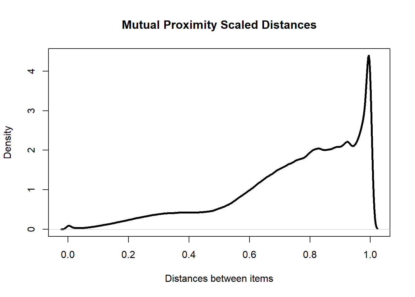
apply(as.matrix(mp_item_distance_mat),
      MARGIN = 1,
      FUN = extract_k_dis,
      k = 6) %>%
  e1071::skewness() %>%
  cat("k-neighbourhood skewness of scaled distances is: ",.)
## k-neighbourhood skewness of scaled distances is: 0.6468721Concentration is the tendency for objects in a high dimensional space to be at almost the same distance away from every other point.
The positive skewness of the k-neighbourhood distances has decreased dramatically after scaling the data. This shows that this method has succeeded in reducing the number of hub points in the data. The overall distribution of distances is also more desirable as there are far fewer points with distances close to 0. This means that there are fewer points that are “on top” of each other.
One major advantage with using Mutual Proximity is that the distances between items are interpretable. Consider the MP scaled distances between the Robot Pencil Sharpener and these two other products:
| StockCode | Description |
|---|---|
| 10002R | ROBOT PENCIL SHARPNER |
| 10109 | BENDY COLOUR PENCILS |
## MP Scaled Distance: 0.42| StockCode | Description |
|---|---|
| 10120 | DOGGY RUBBER |
| 10002R | ROBOT PENCIL SHARPNER |
## MP Scaled Distance: 0.74This sharpener is closer to a pencil than an eraser. This purely based off of the features I created earlier. This makes sense as one can think of scenarios where it is more likely that you would buy a pencil to accompany this sharpener rather than an eraser (the pencil could already have an eraser on it already).
But what do these distance values mean? Remember the probabilistic definition of MP discussed earlier. A scaled distance value of 0.42 between the sharpener and the pencil means that based off of the data, there is a 42% chance of seeing another item which is closer to the sharpener.
One can say that the 0.42 MP scaled distance between the sharpener and pencil represents a 58% similarity match! MP scaled distances are much easier to explain to stakeholders than opaque Euclidean distances.
Now that the distance matrix has been scaled, the items are ready to be clustered based off of this information.
Clustering
The Partitioning Around Medoid (PAM) will be used. This can be viewed as a k-medoid algorithm. It is more robust to outliers than k-means. The main advantage in my mind is that an actual item in the data is used as the medoid or centre of a cluster. This makes interpretability a little easier as you don’t have to deal with a mean/weighted mean centre between items.
PAM: Optimal Number of Clusters
The NbClust package contains many tests which can help you determine the optimal number of clusters to use. The conclusions or votes of each test are shown below:
# Perform a variety of tests to detemine k
num_clusters_test <-
  NbClust::NbClust(
    data = select(item_performance,-StockCode),
    diss = mp_item_distance_mat,
    distance = NULL,
    method = "centroid", # PAM uses the centroid approach
    min.nc = 2,
    max.nc = 8,
    index = "all"
  )
# Visualise conclusions of each test
factoextra::fviz_nbclust(num_clusters_test)## Among all indices:
## ===================
## * 2 proposed 0 as the best number of clusters
## * 7 proposed 2 as the best number of clusters
## * 1 proposed 3 as the best number of clusters
## * 4 proposed 4 as the best number of clusters
## * 11 proposed 6 as the best number of clusters
## * 1 proposed 7 as the best number of clusters
##
## Conclusion
## =========================
## * According to the majority rule, the best number of clusters is 6 .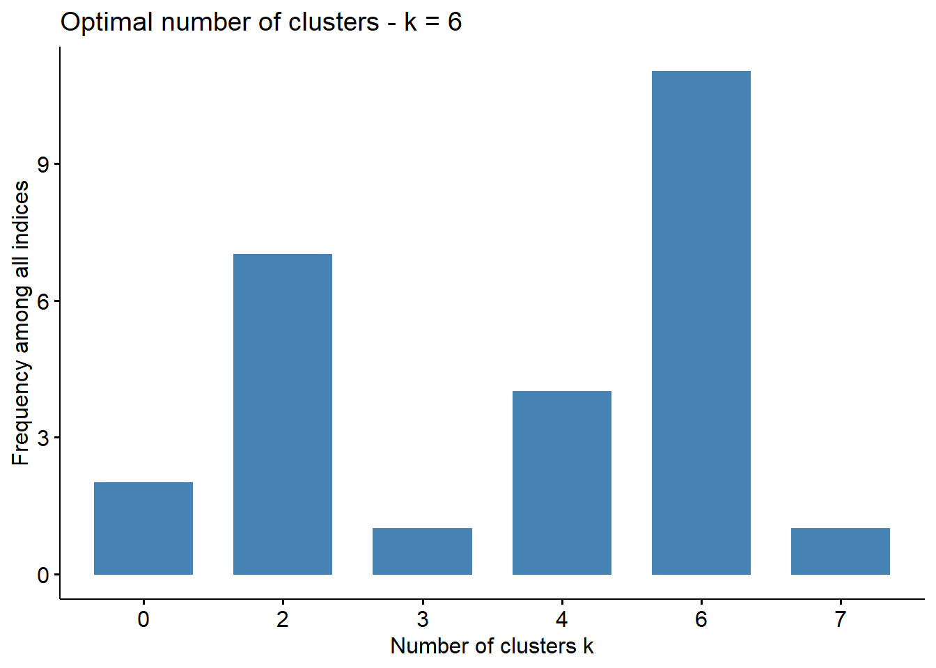
Majority of the tests suggest a total of 6 clusters is optimal. A PAM model is trained below.
#Train the model according to the MP scaled distance matrix
pam_cluster <- cluster::pam(k = 6,
                            x = mp_item_distance_mat,
                            diss = TRUE)
#Store The Cluster Assignments
item_performance$Cluster <- pam_cluster$clustering
Visualization of Clusters
The trimmed dataframe with the features that were engineered earlier contain a total of 17 features. In order to visualise the groups/clusters of product items, the distances between them have to be visualised on a 2D or 3D plane.
I adopted to use the non-metric Kruskal’s Multidimensional Scaling method. Multidimensional scaling attempts to reduce a high dimensional input space and present items on a much lower dimensional output space with minimal information between the items being lost.
Non-metric means that the algorithm does not try to preserve the exact metric distances (Euclidean in this case) between items on this 2D plane, but instead it preserves the ranking of distances between items. The closest item to product A in the input space should still be the closest item in the output space, but the magnitude of the distance is not guaranteed to be preserved.
For comparison, I have created the 2D visualisation output space of the distances between items before and after Mutual Proximity scaling below.
#Fit the Kruskal non-metric MDS models
mds_fit <- isoMDS(item_performance_dist, k=2, maxit = 20)
mds_fit_mp <- isoMDS(mp_item_distance_mat, k=2, maxit = 4)
# MDS of distance matrix without global scaling
mds_non_scaled <- mds_fit$points %>%
as_tibble() %>%
mutate(Cluster = as.factor(pam_cluster$clustering),
`Global Scaling` = FALSE)## Warning: `as_tibble.matrix()` requires a matrix with column names or a `.name_repair` argument. Using compatibility `.name_repair`.
## This warning is displayed once per session.# MDS of distance matrix with global scaling
mds_scaled <- mds_fit_mp$points %>%
as_tibble() %>%
mutate(Cluster = as.factor(pam_cluster$clustering),
`Global Scaling` = TRUE)
mds_points_all <- bind_rows(mds_non_scaled, mds_scaled)
#Extract Medoid Information
mds_medoids_non_scaled <- mds_fit$points[pam_cluster$medoids,] %>%
as_tibble() %>%
mutate(Cluster = as.factor(1:6),
`Global Scaling` = FALSE)
mds_medoids_scaled <- mds_fit_mp$points[pam_cluster$medoids,] %>%
as_tibble() %>%
mutate(Cluster = as.factor(1:6),
`Global Scaling` = TRUE)
color_sample <-
brewer.pal(n = length(unique(pam_cluster$clustering)), name = "Set2")
mds_points_all %>%
ggplot(aes(x = V1, y = V2, col = Cluster, fill = Cluster)) +
#stat_binhex() +
geom_point(alpha = 0.5, position = "jitter", size = 4, pch = 1) +
geom_point(data = mds_medoids_non_scaled, pch = 10, size = 18, stroke = 3) +
geom_point(data = mds_medoids_scaled, pch = 10, size = 18, stroke = 3) +
scale_color_manual(values = color_sample) +
scale_fill_manual(values = color_sample)+
labs(x = "Dim1", y = "Dim2", title = "PAM clustering with and without Global Scaling") +
facet_wrap(~`Global Scaling`,labeller = label_both) +
theme_minimal() +
theme(panel.grid.major = element_blank(),
panel.grid.minor = element_blank(),
text = element_text(size = 30))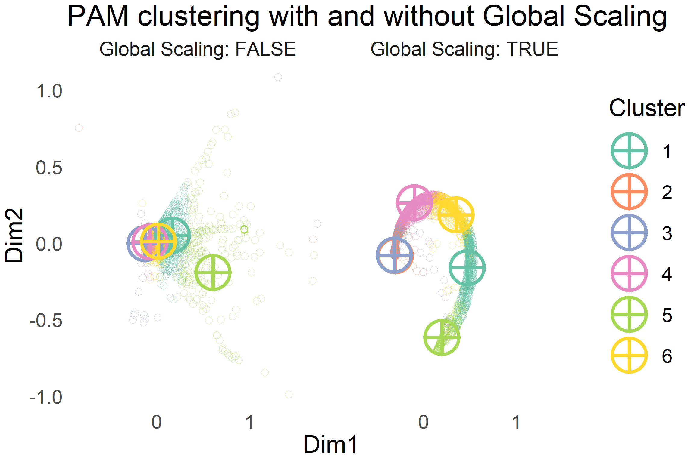
It can be seen that scaling the distances by using Mutual Proximity allows for a tighter clustering of points. This allows a partitioning clustering algorithm like PAM to easily partition the items into different groups or clusters.
I question the utility of having clusters 2 and 3 as separate groups in the MP scaled clustering. I suspect it is due to the collection of noisy items which stray further away from the characteristic swirl in the MP scaled plot. In reducing the overall average distance from each item to it’s cluster’s medoid, the outlier items seem to benefit in having two cluster medoids close to each other.
Other methods such as DBSCAN allow for the clustering of items as noise points. These items do not form part of any cluster. In my personal opinion, this method is quite sensitive to the hyperparameters and thus it requires a lot of tuning. PAM seems to do a good enough job for the vast majority of items and thus it will be sufficient in giving us a good overall idea of the relationships between items.
For the sake of easier inference with slightly lower quality of cluster partitions, I merged cluster 3 into cluster 2.
What do the clusters represent?
I have plotted the visualization of the clusters after merging below.
#Plot the viz. with reduced number of clusters
color_sample_reduced <- brewer.pal(n = 5, name = "Set2")

mds_scaled_reduced <- mds_fit_mp$points %>%
  as_tibble() %>%
  mutate(Cluster = as.factor(pam_cluster_reduced$clustering),
         `Global Scaling` = TRUE)
## Warning: `as_tibble.matrix()` requires a matrix with column names or a `.name_repair` argument. Using compatibility `.name_repair`.
## This warning is displayed once per session.mds_medoids_scaled_reduced <- mds_fit_mp$points[pam_cluster_reduced$medoids,] %>%
as_tibble() %>%
mutate(Cluster = as.factor(1:5),
`Global Scaling` = TRUE)
mds_scaled_reduced %>%
ggplot(aes(x = V1, y = V2, col = Cluster, fill = Cluster)) +
#stat_binhex() +
geom_point(alpha = 0.5, position = "jitter", size = 4, pch = 1) +
geom_point(data = mds_medoids_scaled_reduced, pch = 10, size = 18, stroke = 3) +
scale_color_manual(values = color_sample_reduced) +
scale_fill_manual(values = color_sample_reduced)+
labs(x = "Dim1", y = "Dim2", title = "Reduced PAM cluster") +
facet_wrap(~`Global Scaling`,labeller = label_both) +
theme_minimal() +
theme(panel.grid.major = element_blank(),
panel.grid.minor = element_blank(),
text = element_text(size = 15))
Each cluster has a representative item, called the medoid, which characterises the median behaviour of the cluster in a sense. The attributes of these medoids are analysed below to see if there are meaningful differences from a business point of view between clusters.
# Grab the representative medoid product items for each cluster

cluster_medoid_attributes <-
  item_performance[pam_cluster_reduced$medoids, ] %>%
  select(Cluster, StockCode, price, everything()) %>%
  # Transform Normalized Quantities Back To Original Scale
  mutate(
    med_qty = med_qty * diff(normalized_vars_ranges[, "med_qty"]) + normalized_vars_ranges[1, "med_qty"],
    price = round(price * diff(normalized_vars_ranges[, "price"]) + normalized_vars_ranges[1, "price"],2),
    max_qty = max_qty * diff(normalized_vars_ranges[, "max_qty"]) + normalized_vars_ranges[1, "max_qty"]
  ) %>%
  rename(
    `Medoid StockCode ID` = StockCode,
    prevalence_rate_percent = prevalence_rate,
    `Price £` = price
  ) %>%
  mutate(prevalence_rate_percent = paste0(round(prevalence_rate_percent * 100, 6), " %"))


#Plot Proportion of Sales that Medoid Object is in each region
cluster_medoid_attributes %>%
  select(Cluster,EIRE:`Channel Islands`) %>%
  pivot_longer(names_to = "Region", cols = -Cluster) %>%
  mutate(Cluster = as.factor(Cluster)) %>%
  ggplot(aes(x = Cluster, y = value*100, fill = Cluster)) +
  geom_bar(stat = "identity") +
  scale_fill_manual(values = brewer.pal(n = 5, name = "Set2")) +
  labs(y = "% Of Cluster Medoid's Revenue per Region",title = "Popularity of Cluster Medoids per Region") +
  facet_wrap(~Region,nrow = 3 , ncol = 4)
#Produce Table of Medoid Item Characteristics
cluster_medoid_attributes %>%
  select(Cluster:prevalence_rate_percent) %>%
knitr::kable(col.names = c("Cluster","Medoid Stock ID","Price £","Max Qty.","Median Qty.","Prevalence Rate in Transactions %"))| Cluster | Medoid Stock ID | Price £ | Max Qty. | Median Qty. | Prevalence Rate in Transactions % |
|---|---|---|---|---|---|
| 1 | 22846 | 17.23 | 17 | 2 | 0.015804 % |
| 2 | 90070 | 6.24 | 7 | 2 | 0.004097 % |
| 3 | 22055 | 2.18 | 161 | 4 | 0.104577 % |
| 4 | 21432 | 6.05 | 49 | 3 | 0.047216 % |
| 5 | 22567 | 1.38 | 241 | 12 | 0.059898 % |
- Cluster 1 High Value, High Reach
- Very high value items that occur infrequently in transactions compared to other clusters. These products have a strong reach in the European markets like Cluster 4.
- Cluster 2 UK-centric
- Medium value items that occur infrequently in transactions. Almost exclusively sold in the UK.
- Cluster 3 Frequent Valued Bulk
- Low value items that occur frequently in transactions. However, they have the highest estimated sales prices compared to all of the other bulk clusters. They can be bought in bulk quantities in the UK or Ireland. This cluster represents wholesalers in these regions.
- Cluster 4 EU-approved
- Medium value items that can be bought in bulk but possibly in more modest quantities. These products are estimated to have the biggest European appeal among all clusters. Less than 33% of the total revenue of the medoid comes from sales in the UK!
- Cluster 5 Cheap ’n Cheery Bulk UK
- Very low value items that are estimated to have the highest bulk purchase potential. Dominantly sold in the UK, but do have appeal to wholesalers in Germany and EIRE.
Note: Yes the names are terrible, but I could’ve honestly ploughed in many hours trying to come up with better ones. I had to call it quits eventually.
Finally, I have plotted the total monthly sales of each cluster over time.
item_performance %>%
  select(StockCode,Cluster) %>%
  inner_join(retail) %>%
  mutate(InvoiceDate = floor_date(InvoiceDate,unit = "month")) %>%
  group_by(Cluster,InvoiceDate) %>%
  rename(Date = InvoiceDate) %>%
  summarize(total_sales = sum(Price*Quantity)) %>%
  ggplot(aes(x = Date, y = total_sales, col = Cluster , group = Cluster)) +
  scale_color_manual(values = color_sample_reduced) +
  scale_x_datetime(date_breaks = "1 month") +
  scale_y_continuous(labels = scales::format_format(big.mark = " ", decimal.mark = ",", scientific = FALSE),limits = c(0,500000)) +
  labs(y = "Total Monthly Sales £", title = "Monthly Sales per Cluster") +
  geom_point() +
  geom_line() +
  theme_minimal() +
  theme(axis.text.x = element_text(angle = 90))
## Joining, by = "StockCode"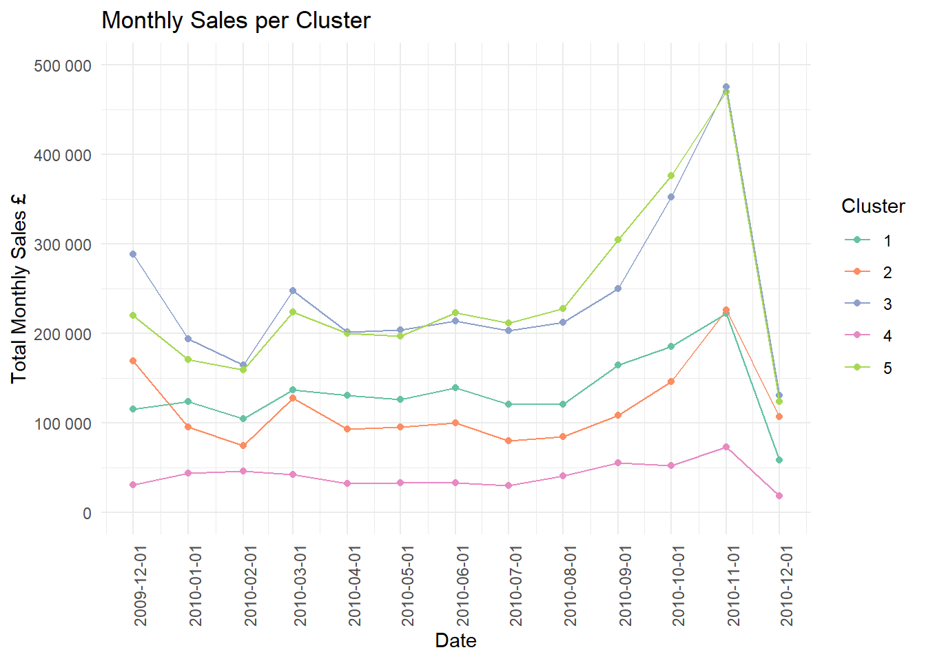
A limited view of the sales is present but the “bulk” clusters 3 and 5 peak especially in November with a dramatic drop off in December. There also seems to be a significant uptake period a few months before when items in this cluster are bought in larger quantities than other months.
This sort of time series analysis can help the retailer to plan which items to stock and when. I shall leave this for another time as this post is possibly too long already.
Closing Remarks
We have seen that through careful feature creation, it can be possible to draw meaningful similarities between items. High dimensional data can pose the risk of there being many hubs in the data. Global scaling through Mutual Proximity was shown in this scenario to be a viable method to solve this issue. The major upside is that it adds a new layer of interpretation to Euclidian distances.
Future Work
Product descriptions are available in the sales data. Vector representation of text descriptions can be used to calculate a measure such as cosine similarity between product description vectors that have been embedded in vector space using algorithms such as word2vec. The flexibility of Global Scaling allows for the linear addition of different distance spaces together so it could be interesting to add in this additional layer.
Clusters here represent a static snapshot at the end of a time scale. Methods such as Growing Neural Gas are able to create nodes or clusters when necessary by some criterion. This could be useful in modelling evolving interaction behaviour between products.
More work can be done in explaining which features drove the similarity measure (or probability) between items and the cluster ID. A supervised model could be fit to predict the PAM clustering IDs based off of the engineered features for the purpose of inference.
More sophisticated Time Series analysis in order to identify more nuanced trends in sales.
Thanks for reading :)

References
Besides the paper on Global Scaling, I found that these articles were useful: